
Monday, May 2, 2011


Tuesday, March 29, 2011
Label redisign
For our next project we are to choose a product (food, drink etc.) that has a label that "needs" a redisign. I chose FLA VOR ICE a freeze pop package.


Audio book jewel case design
for this project there really wasn't any sketching done because we were using the book cover from the previous project that we did. In my case that would be "The Scarlet Letter." Most of the time on this project was spent getting the dimensions down.


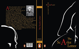
Scarlet Letter book cover final
I decided on a more simplistic type of illustration for the cover, sillohetted outlines of a woman (Hester Prynn) in a hooded cloak telling her daughter on the back cover (Pearl) to hush.

Subscribe to:
Posts (Atom)