
Monday, May 2, 2011


Tuesday, March 29, 2011
Label redisign
For our next project we are to choose a product (food, drink etc.) that has a label that "needs" a redisign. I chose FLA VOR ICE a freeze pop package.


Audio book jewel case design
for this project there really wasn't any sketching done because we were using the book cover from the previous project that we did. In my case that would be "The Scarlet Letter." Most of the time on this project was spent getting the dimensions down.


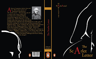
Scarlet Letter book cover final
I decided on a more simplistic type of illustration for the cover, sillohetted outlines of a woman (Hester Prynn) in a hooded cloak telling her daughter on the back cover (Pearl) to hush.

Monday, February 14, 2011


Tuesday, February 8, 2011
Book Cover 1
I am currently designing a book cover for my Graphic Design II class. I chose "The Scarlet Letter", and so i must come up with a creative solution for a book cover that does not follow the same old formula as the many predecessors before it. Here are some designs that i need to stay away from:


 Most of the designs for this book rely on only the letter itself. I obviously want to use the Letter as an element in the design, however i would like to use it in conjunction with other symbols and use more than "just the letter".


Thursday, February 3, 2011
Dracula Theatrical Poster Final
GD II Project 1: #3) After a few tweaks i had decided to re-sketch the "D" and the "A" so it would appear in blood as well.
 I incorporated the "D" and "A" into the design as well as taking out the bottom fangs and adding the text for the play's information, such as dates and call numbers. This is the final result:


Dracula Theatrical Poster Progress

Dracula Theatrical poster Sketch
GD II Project 1: #1) I was to create a poster for a play that would be playing at the North Carolina Theater. We chose from a list of plays and i chose "Dracula". This is the sketch i started with.

I started out with a play on the design being part of the text, the teeth would be the "D" and the "A" at both ends and the rest of the title would be in the blood between the teeth.

Tuesday, January 18, 2011
Subscribe to:
Posts (Atom)